Dark Creations
Package Design & Branding
Dark Creations is a dark chocolate bar distributor that showcases a new style and flavor of rich dark chocolate. The packaging is designed to present the new chocolate as brilliant and a magical discovery of flavor. The treatment of type and color are intermixed to play off of the dark theme. I choose to create a chocolate bar in a dark fantasy theme because I wanted to get away from the norm of displaying chocolate on the cover.
Program Used: Photoshop and InDesign
Medium: Print
Feature Page
Advertisement & Editorial
Social Media Terrorism is a feature article in a magazine. This article is designed so that the reader will feel warned about the dangers described in the article. The title type face is designed to look like a ransom note and the 2nd spread is supposed to resemble an investigation board. The challenge of designing this article was breaking up a text heavy article.
Program Used: Photoshop and InDesign
Medium: Print
Transworld Magazine
Editorial Redesign
TransWorld Magazine was an international magazine on skateboarding focused on bringing the community together. In this redesign, I used elements of design and type to unify the article. The use of bright colors, imagery, and vector art creates a fun and interesting article. I choose to redesign this article because the original article looked boring and devoid of life. In this redesign, I designed it to attract younger viewers.
Program Used: Photoshop, Illustrator and InDesign
Medium: Print
Undertow
Poster Design & Advertisement
Undertow is a student project that had me create a movie poster and idea from a photo that I have taken. I decided to go to the beach to take some photos and found tide pools which became the center on my story line. I was able to capture a pristine photo and created my movie idea from this image. I had the idea that tide pools are inter-dimensional portals. The main synopsis of my poster is “What lies through the tide pool?”
Program Used: Photoshop
Medium: Print / Digital
Magazine Fold-Out
Editorial & Info-graphic
The Sky is the Limit was a student project, tasked with creating a magazine foldout time-line info graphic. I chose to do this info-graphic on the timeline and advancements in fighter aircraft. The difficult part of this project was simplifying and condensing all the information that I found on to 6 pages. For the introduction pages, I wanted to capture the stunning beauty of the fighter jet. The next section showcases a timeline of major advances in fighter aircraft as well as weapon systems. The last part of the foldout describes the different wing configurations and the technology that helps the pilot.
Program Used: Photoshop, Illustrator and InDesign Medium: Print
Climbing the Crux is a UI designed for climbers. The website was designed to be informational and to help assist with training, learning and knowledge of the gear that you need. For beginners, rock climbing can be very confusing and difficult to learn how to be successful. If people don’t know exactly what they are doing, they may become discouraged to continue climbing.
Problem: Climbing is difficult to learn and requires knowledge and tips to progress.
Solution: Climbing the Crux offers information that is vital to be successful in the sport of climbing. In the learn section of the website, new climbers will be able to learn knowledge and skills such as Holds, Footwork, Tips, Positions, Knots and Climbing Lingo. In the gear pages, people can learn about gear they
need such as shoes, harnesses, ropes, hardware and clothes.
Greeting Card
Personal Card
This Thanksgiving greeting card is a personalized family card. Using illustration, type and color, the card is able to give a warm invitation in the holiday spirit. I created a digital illustration that combines the foods and colors of the Thanksgiving holiday.
Program Used: Photoshop and InDesign
Medium: Print
MattxFitness Banner
Social Media
This banner was created for a commissioned piece to create a new look for the client. I used my illustration skills to paint the background and used a typeface that worked well with the organic nature of the piece.
Program Used: Photoshop
The Last Rule
Publication
The Last Rule was a commissioned piece of artwork for a fantasy-christian book cover. I had worked closely with the author to figure out a successful
book cover that includes elements of the story that gets the audiences attention without giving the story away. I was able to use my illustration skills to develop a surreal fantasy image. I was also able to develop the typeface which interacts with the illustration.
Program Used: Photoshop and InDesign
Medium: Print
Jurassic Park
Publication
Student project to redesign a book jacket. I chose to design Jurassic Park with a scene from the original book.
Program Used: Photoshop and InDesign
Medium: Print
Inheritance Cycle Redesign
Publication
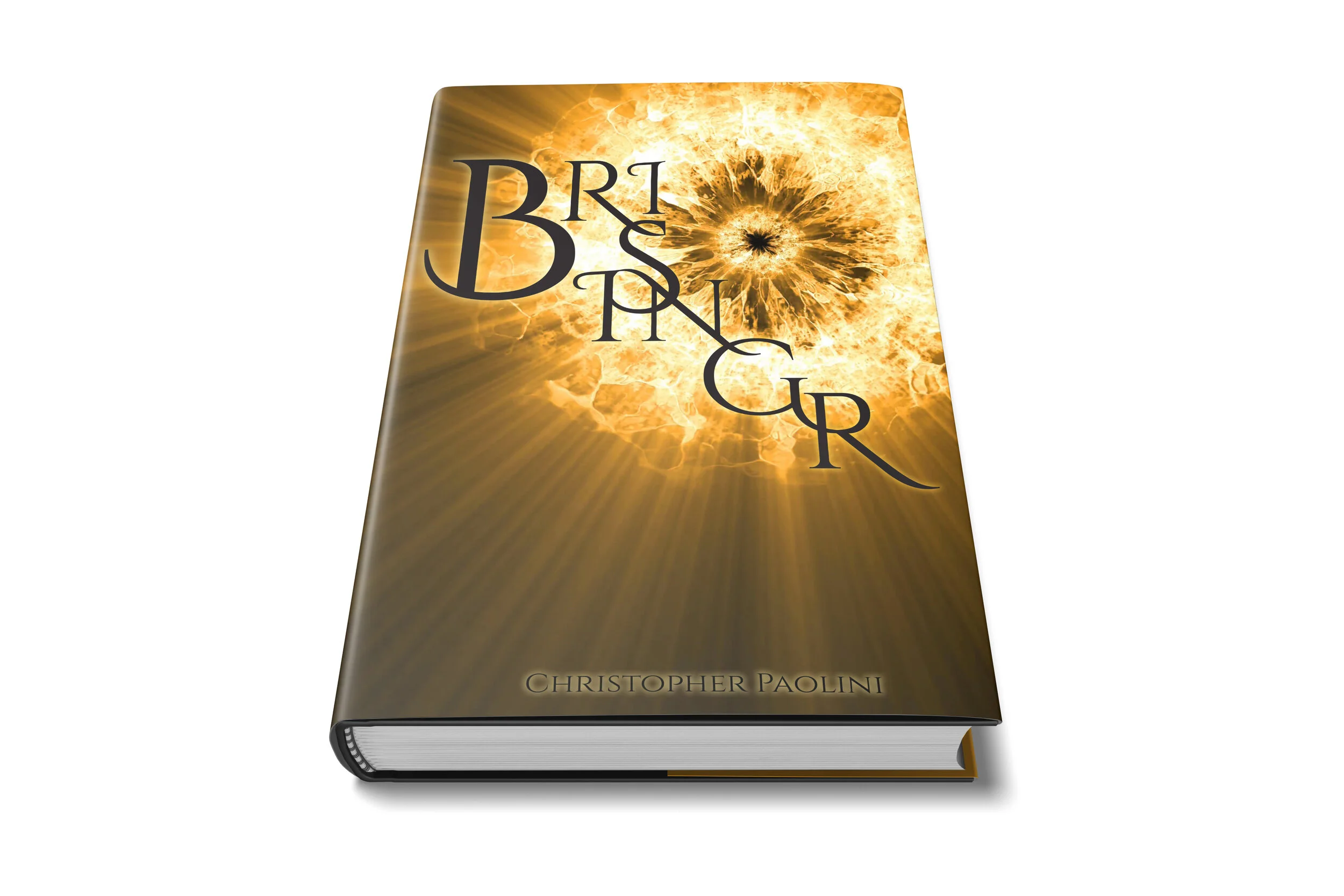
The Inheritance Cycle Books are a collection of fantasy novels written by Christopher Paolini. For a school project, I decided to redesign the book jackets. I was required to come up with solutions only using type. The difficult part of this project was figuring out a way to display the title in an elegant way because it is only one word. These are the solutions that I came up with.
Program Used: Photoshop and InDesign
Medium: Print
Back-Packing Essentials
Editorial & Info-graphic
Back-Packing Essentials is an editorial info-graphic designed to help people get ready for a camping trip. With bright colors and fun illustrations, the article is easy to read and get a clue of what the reader needs.
Program Used: Illustrator and InDesign
Medium: Print
Ankler and Spatula
Logo Design
Website Banner Design
Holographic Logo for Website Banner
Logo Progression
Logo design progress for Start-up


